Many people are familiar with the 16 EGA colors, but SCI0 uses these colors for more than just making things look pretty. Today’s dish will be 1 part update and 1 part dive into how SCI0 uses the 16 EGA colors.
Betrayed Alliance News:
My focus lately has been setting up the gameplay elements inside a building that the two characters get separated in. They must use their cunning to solve various puzzles and challenges, meet up together in the main hallway, and escape with new knowledge and maybe an item or two to help them on their quest moving forward.
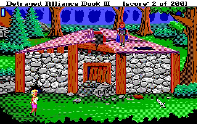


All together there are 12 “inside” screens: 8 dorm rooms, 2 for the main hallway, and 2 more for the side halls that connect the rooms together.
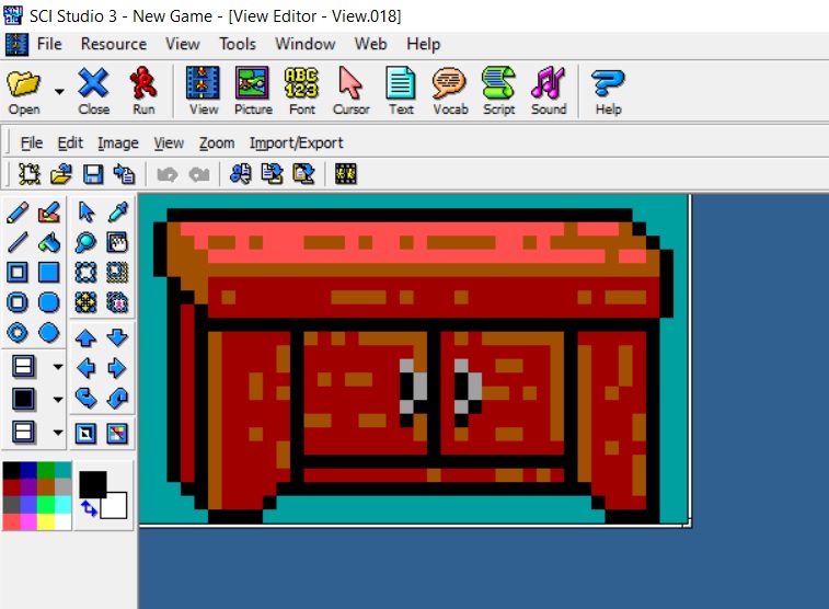
Instead of drawing 8 unique rooms, however, I’ve opted to use a similar approach as some of the forest backgrounds in Quest for Glory 1, where they reused the same background only reversed as if through a mirror. Filling up the rooms with different furniture, most of which were provided for me by Karl Dupere-Richer.

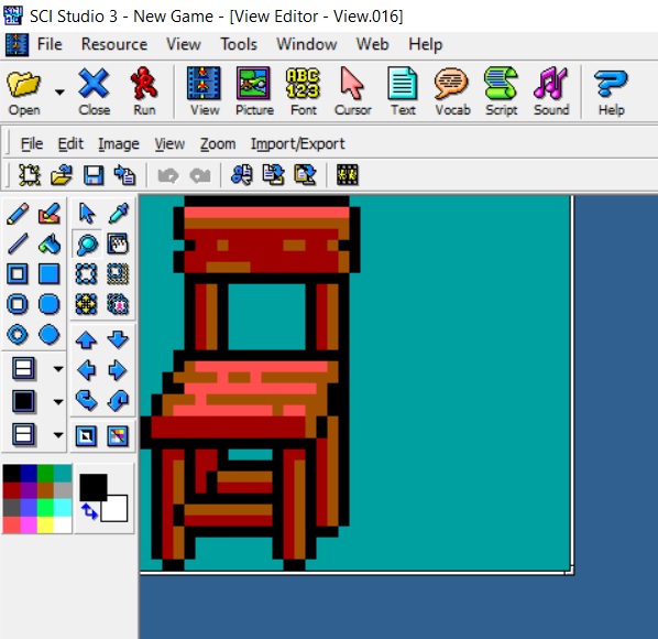


Of course putting all the same images in each room wouldn’t be enough, so I had the pleasure of taking some of these and changing them a bit. Messing up the bed (or changing the color of the blanket), making some side views of the chairs, breaking the closets and tables, etc.


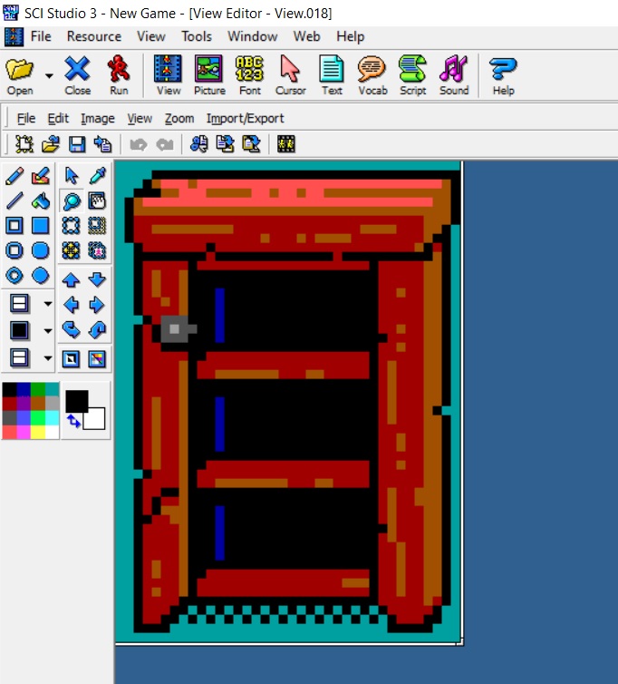

Additionally, I added a few other items as would be needed:
Of course simply rearranging furniture in each room won’t solve the issue that each room will “feel” the same, so I’m endeavoring to give each room its own unique twist, based on the person who used to live there, but I don’t want to say too much about that.
EGA colors and their non-visual functions:
As promised, I wanted to share a bit about how the 16 EGA colors are used for more than just the visuals of the game. There are actually three versions of each background, but the player only sees one, the visual. But there is also a Priority background and a Control background. They look something like this:
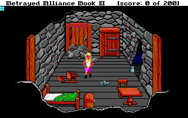

Priority:
The visual background is exactly what you’d expect: it’s what you see. The Priority background is used to determine whether to draw something visually in front of or behind another object. You’ll notice the white outline of the wall on the bottom of the Priority screen. That is to make sure that nothing should be seen in front of the wall that is closest to the screen. As you “go up” the screen, every 10 or so pixels there will be an invisible color change to determine whether the player character should be in front or behind an object. If you were to see them, they would look like this:

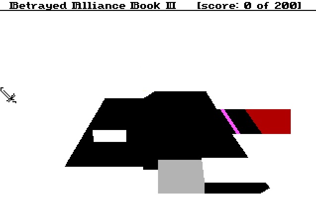
Control:
This background is used to determine a couple things: first, where the player can and cannot move, and second, anything else you want to do!

The color white acts as a blocked off area for the player. In this example, I’ve also made it so if you want to interact with the chest at the foot of the bed, you must be in the Silver-colored area, or else you get the dreaded stock phrase: “You’re not close enough.”
The Pink (or “Fuchsia”) is used to trigger an event when the player walks into it. And the color Red (or “Maroon”) is used to take the player to a new room when they step on it.
You can also uses both Priority and Control colors for “right-click-look,” a handy little feature that I always appreciated. Simply determine if the player clicked while the cursor is over a particular color on either of the invisible background versions and you can return a response.
I hope you enjoyed this little look under the hood. Until next time!
